
Power BI - Reports
MPC
Overview
Power BI is being used to create reports directed to Senior Management of the company. This will better drive the business with correct decisions by analyzing all the data generated by our internal tools. My role in this process was to create the right structure/template and UI kit to be applied to the reports.
Role
Product DesignerResearch, Information Architecture, Visual design and testing
Team of 1 designer, 3 data analysts and 1 developer
The Problem
There are a lot of question that senior management needs an answer to better direct the future of the company. Before we started this project we had many reports that where being created using Microsoft Excel or in-house software. The data being used although correct, all reports had a different look and feel and some of those reports took up to a week to be created.
Solution
Having a centralized point of information like PowerBI with a professional look and feel. To address the look and feel of the reports we had to create a structure/template and UI kit that all the new reports would follow. This will allow the data analyst to be self-sufficient on creating new good looking reports that any user can follow.
Discovery
Requirements
- How can we have a clean and consistent visualization of the data;
- Be able to drill down the information with:
- Zoom,
- Filters,
- Details on Demand;
- Optimal resolutions for Desktop and Table;
- Integrate with DASH, our in-house Resource Manager software
Research
Once I knew what were the requirements I could start working on finding a solution to this problem. Started by:
- Understand what are the limitations of the new software (PowerBI);
- Collecting the current reports to see what was the structure used;
- Understand how and why they where structure the way they were;
- Explore and find the limitations of the software;
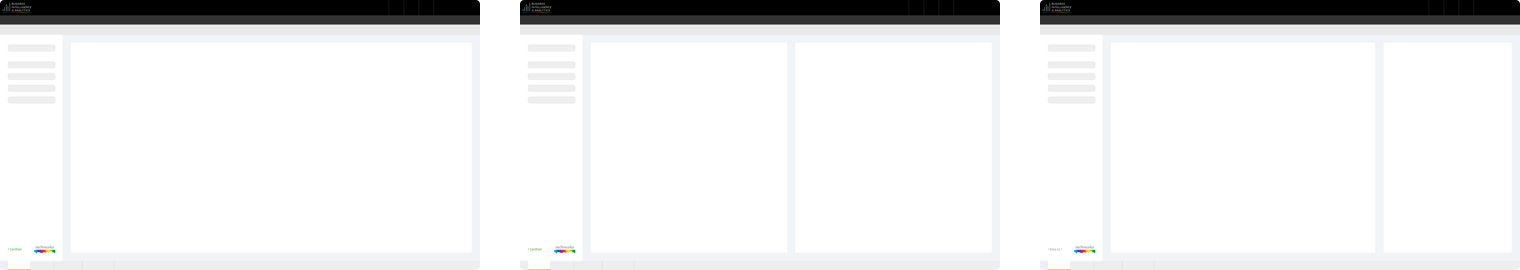
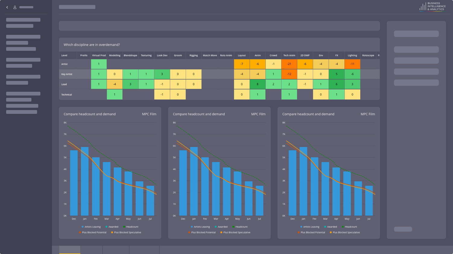
Wireframes
With this information, I could start working on the wireframes. They will define the structure of all current and future reports. Here you can see an already polish wireframe that is used to create the final designs.

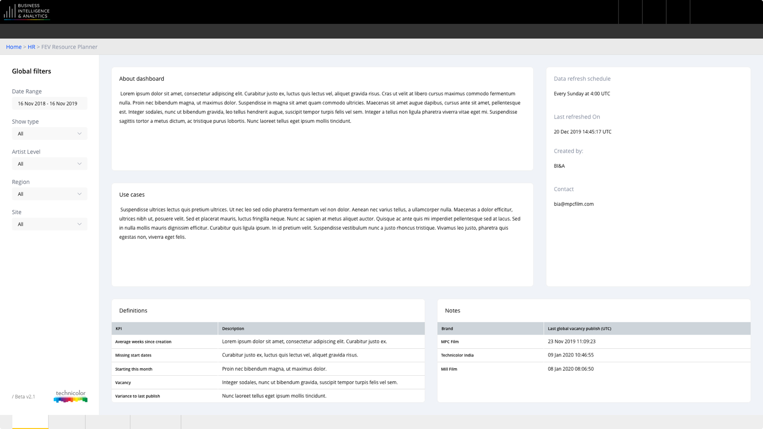
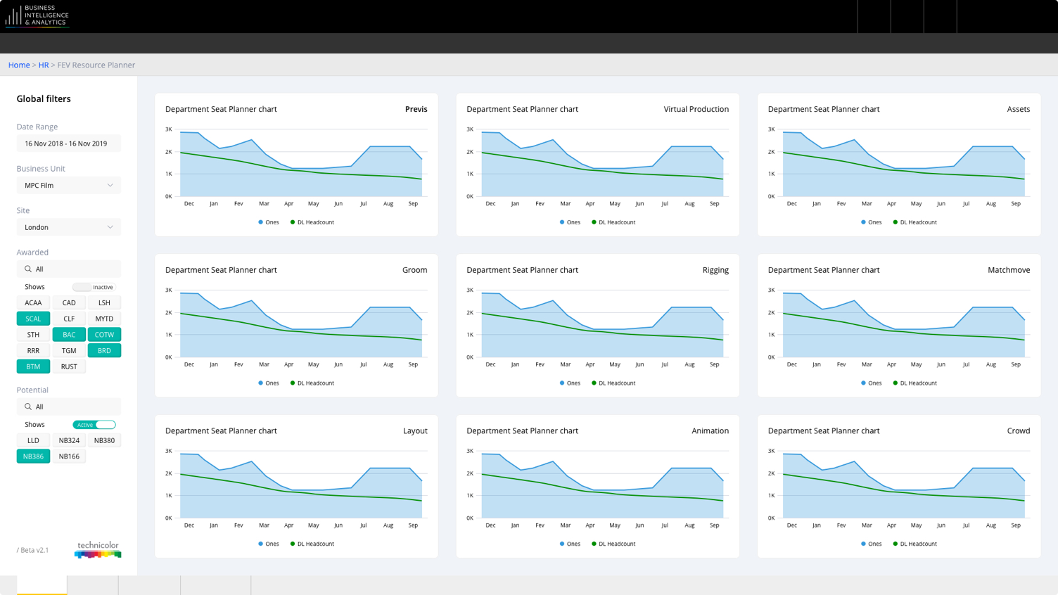
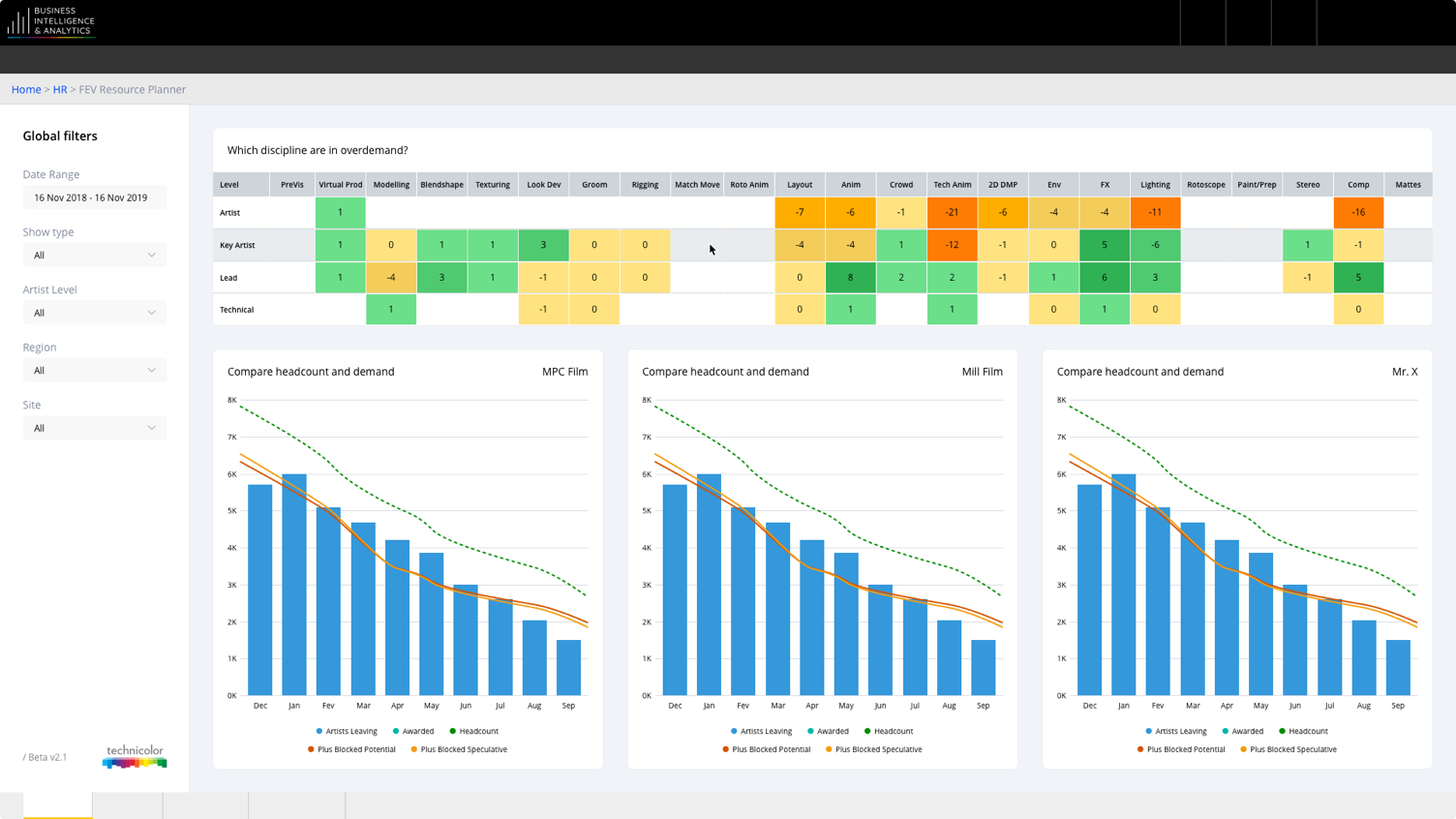
Light UI Solution
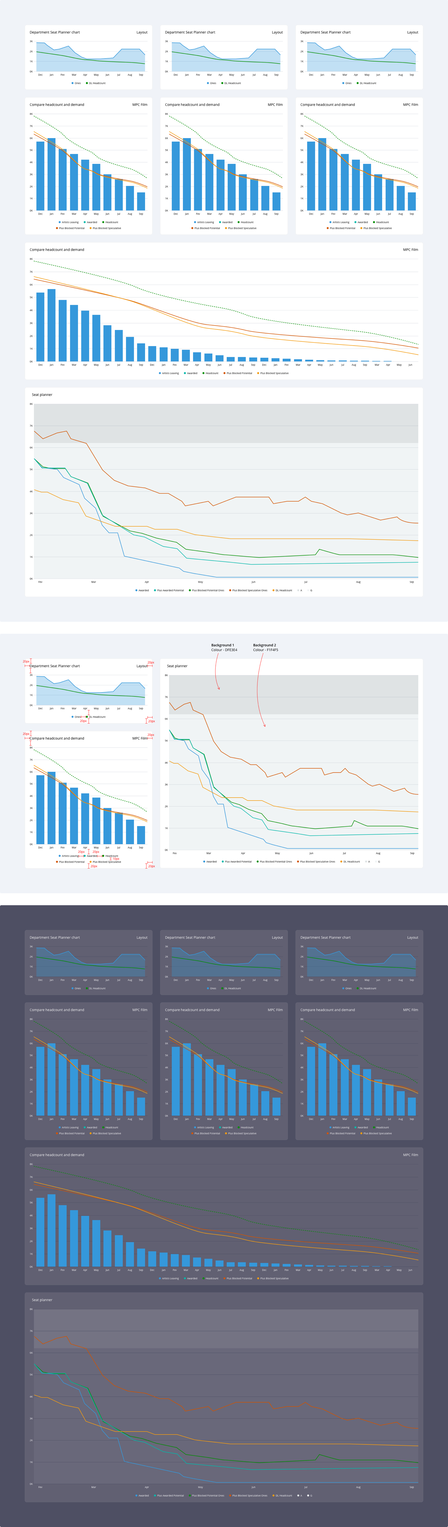
Dark UI Solution
Once we had the final look and feel, I had to adapt to a dark theme. There was another internal software with a dark theme that needed access to these reposts.

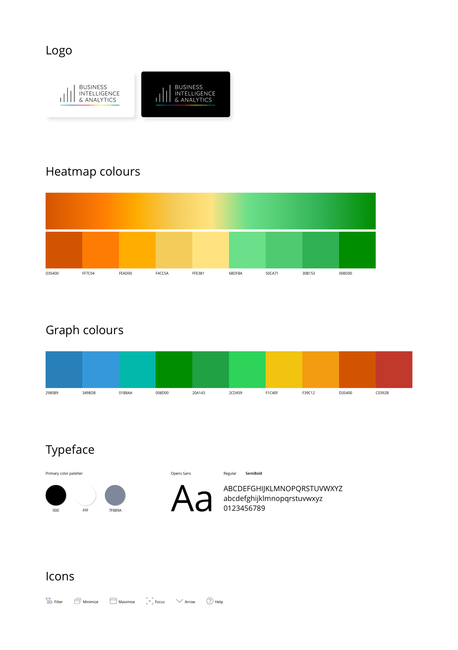
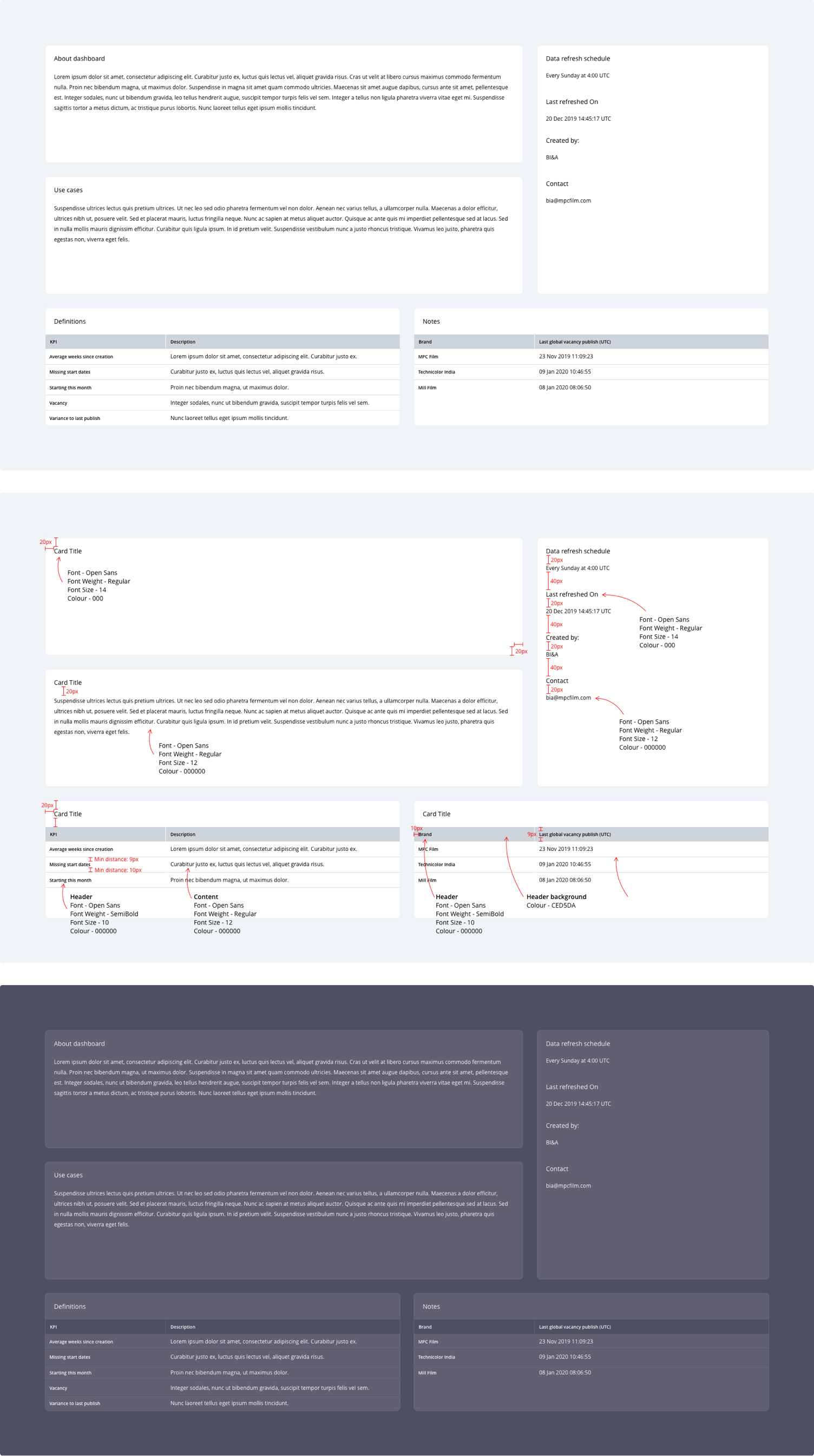
UI Kit - Breakdown


Impact
Create beautiful and compact interfaces that any user can understand what's going on and don't feel overwhelmed. The feedback so far has been really positive from stakeholders, users and our data analysts. With this kit, our team can be self-sufficient on creating new good looking reports with consistent look and feel.
